The main image used on this poster is a close up shot of what may be the horror character is the film. The image is effective as the eyes of the person are used as the mouths of other people which gives the disturbing effect to the image. The fast that it is holding the phone relates to the Title 'One missed call', although I think a main clear close up shot of the character gives too much away of it and will not scare people as much when they go and watch it. However this may be a trick that the poster uses to the audience as this may not be what is to be afraid of in the film.
The layout is clear for poster with the title being in white capital letters which stands out with the black background. I think the black background blends well with the white and red font making it more effective and easier to read.
The sell line of the film at the top is also effective as it addresses the audience in by using the pronoun 'You' making it even scarier to go watch it.
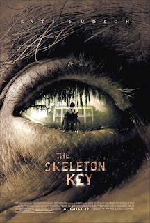
This film poster is effective as it uses a close up shot of what seems to be an old man's eye, with a long shot inside the eye of a boy. This gives the effect that the boy being watched inside the eye is the victim and the old man seems to be the protagonist.
This poster has also gone for a similar layout with a main image in the middle with the name of the film lower down and the sell line or USP on the top of the poster. The USP of this poster being 'Kate Hudson', by putting this on the poster it will invite the audience to go and see the film who are familiar with her.
This poster also has used a dark colour scheme on it's poster with lighter colouring of the font and being in capital letters to make it stand out more. The word 'KEY' on the poster also shwos to be effective with the shape of a key hole being used for the 'E'.
I really like this horror poster and think it is extremely effective due to the main image and layout.
The main image is a close up shot of what could be a victim or villian, but the way it has been presented in darkness and with scary wide eyes could indiacte to be either as it doesn't reveal too much.
Once again the blackenss of the poster brings out the Title in capital letters and a light font, also the wideness and whiteness is more clear which makes it more scarier to the audience.
The sell line on this poster is also at the top saying 'From the director of The Hill's have eyes'. This will immediately attract any viewers of that film who enjoyed it, implying that they will like this film also.
This film poster in chinese however it still follows similar attributes to the other posters, such as the black background and the again the capital title in lighter font. However this uses 2 images instaed of one main one.
The Film title is situated in the centre of the poster with the two images being above and below it, I think this is effective when wanting to use two images on the poster one revealing a victim and one the villian but by not giving too much away about it in appearance as it is in darkness.
It seems common for most film posters including this one to situate the film title at the bottom of the poster with the billing board being underneath it. This is an effective way as the reader is firstly drawn in to the main image in this case is a long shot of a villian in the mise en scene of woods. The low angle shot indicates the power and danger that he holds in this film. This poster also has the mise en scence of darkness which gives the horror element to the film. Also the most common colours of fonts used in the film posters are white and red. This is because the red is an indication of blood and death in the horror genre and the white is clear to read with the black background.


No comments:
Post a Comment